Paste Ready Welcome Email Examples: 3–5 Email Sequences for Marketers

The best welcome-email approach is simple: deliver whatever you promised the instant someone signs up, then follow with a tight 3 to 7 email sequence, each carrying one clear call to action. Brands like Huckberry, Canva, and RXBAR build around that same pattern, whether the goal is account activation, a first purchase, or just building trust. The rest of this guide breaks down real examples, paste-ready templates, and the cadence that makes them work.
TL;DR:
- Most high-converting welcome emails deliver the promised resource immediately and follow with one clear call to action within 3 to 7 days.
- Designing mobile-friendly layouts with large buttons, contrast, and accessible fonts significantly improves engagement among mobile users.
- Effective sequences keep to one CTA per email and test subject lines and button copy to optimize click-through rates, avoiding multiple asks.
- Welcome emails outperform regular campaigns because they arrive when subscribers are most interested, but open rate metrics are often inflated by privacy protections.
- Using proven templates and trigger-based automation shortens setup time and increases the chances of timely, relevant messaging that sustains early engagement.
Table of Contents
- Welcome Email Examples Worth Studying Right Now
- Do Welcome Emails Actually Outperform Regular Campaigns?
- How Do You Structure a Welcome Email Sequence?
- Paste-Ready Welcome Email Templates You Can Adapt Today
- Designing a Welcome Email People Actually Read on Their Phone
- How We Selected and Tested These Welcome Email Examples
- More Welcome Email Formats Worth Testing
- What Separates the Welcome Emails That Actually Drive Revenue
- A Faster Way to Put These Templates to Work
- Sources
- FAQ
Welcome Email Examples Worth Studying Right Now
Not every welcome email is chasing the same outcome, and the strongest examples make that obvious in the first five seconds. Some brands want you to activate an account. Others want a sale before you close the tab. A few just want you to feel like you made the right decision joining their list.
Huckberry leans hard into product discovery. Its welcome message reads more like a magazine spread than a sales pitch, with scannable rows of gear that pull new subscribers deeper into the catalog instead of pushing a single offer. Dragon Alliance does something similar for its outdoor audience: big lifestyle photography up top, then a get-started CTA that feels like a natural next click rather than a demand.
Canva takes the onboarding route. Its welcome sequence is built for people who just signed up for a tool, not a newsletter, so the copy walks through quick wins step by step instead of selling anything. Spartan does the same for race registrants, pairing an account-activation CTA with just enough social proof to make new members feel like they joined something bigger than a mailing list.

Four Seasons shows what a hospitality welcome should look like: restrained, upscale copy that pushes toward a booking rather than a discount code. Birchbox goes the opposite direction on purpose, using its welcome email to push a first-order incentive while previewing the kind of products subscribers will get in their box. RXBAR keeps things almost aggressively simple: one benefit statement, one shop button, nothing else competing for attention.
Moosend deserves a mention not as a brand example but as a resource. Its own welcome email roundup is built specifically as a template library, which is worth bookmarking if you want more raw material to adapt beyond what’s covered here.
| Brand | Email type | Primary CTA | Best for | Notable creative trait |
|---|---|---|---|---|
| Dragon Alliance | Brand welcome | Shop products | Lifestyle and outdoor audiences | Hero imagery paired with a quick CTA |
| Huckberry | Onboarding welcome | Browse catalog | Gear and apparel shoppers | Scannable product rows, editorial voice |
| Spartan | Get-started | Activate account | Fitness and training audiences | Action-driven CTA with social proof |
| Canva | Onboarding | Try a feature | SaaS freemium users | Step-by-step guidance and resource links |
| Four Seasons | Brand welcome | Book a stay | Hospitality and service brands | Luxury tone, booking-first CTA |
| Birchbox | Offer email | Shop first order | Subscription commerce | Offer-driven CTA with product previews |
| RXBAR | Brand welcome | Shop now | Consumer packaged goods | Minimal copy, single prominent CTA |
What ties these together isn’t the industry. It’s that every single one commits to one action per email, a pattern backed by practitioner benchmarks on reply and conversion rates that flag copy problems the moment a sequence tries to do too much at once.
Do Welcome Emails Actually Outperform Regular Campaigns?
Yes, and by a wide margin, mainly because timing does the heavy lifting that copy usually gets credit for. A welcome email lands when a subscriber’s interest is at its peak, right after they’ve made a decision to hand over their inbox. Regular campaigns compete with days or weeks of accumulated inbox fatigue; welcome emails don’t.
There’s a catch in how you measure that advantage, though. Apple Mail Privacy Protection now auto-opens a large share of messages before a human ever sees them, which inflates open-rate reporting across the board. A welcome email showing a 70% open rate might really be getting read by half that number. Click-through rate and downstream conversion don’t have that problem. They still require a real human to act, so treat them as your primary scoreboard and let open rate serve as a rough directional signal at best.
Rewrite the subject line and opening sentence first, since copy is the more common failure point.*
There’s a legal clock running underneath all of this too. The CAN-SPAM Act requires every commercial email to include a working opt-out link, and that opt-out mechanism must stay functional for at least 30 days, with requests honored within ten business days. Pair that compliance window with the engagement window: most high-converting sequences wrap up within 10 to 14 days of signup, while intent is still fresh. Miss that window and you’re mailing a colder list every day you wait.
How Do You Structure a Welcome Email Sequence?
Start smaller than you think you need to. A 3-email sequence covers the essentials for most small businesses and solo marketers, while a 5-email version gives you more room to build trust before you ask for anything.
The 3-email minimal sequence:
- Immediate delivery — the moment someone signs up, send the resource, discount code, or account confirmation you promised. No delay, no upsell, just the thing they asked for.
- One day later — a short follow-up that reinforces value: how to use what they got, or what makes your brand different from the ten others in their inbox.
- Two to three days after that — your first real ask, whether that’s a first purchase, a profile completion, or a reply to a quick question.
The 5-email recommended sequence stretches that same logic out:
- Day 0 — deliver the promised asset instantly.
- Day 1 — a welcome note that sets expectations for what’s coming and why it’s worth staying subscribed.
- Day 3 — social proof or a quick win, showing rather than telling why the brand delivers.
- Day 6 — a soft offer tied to the reader’s likely next step.
- Day 10 to 14 — a final nudge, often a stronger offer or a deadline, closing out the critical early-engagement window before the list goes cold.
Every email in either sequence follows the same rule: one CTA, one promise, one subject-line angle. Splitting attention between “read this” and “buy that” and “follow us” inside a single message reliably drags down click-through, according to the same practitioner data behind the reply-rate benchmarks above.
Run a simple test once your sequence is live. Take email 2 and split it two ways, same body copy, two different subject lines, one framed as a benefit (“Here’s what you get”) and one framed as curiosity (“You almost missed this”). Then do the same test on the CTA button text alone in email 4, comparing something direct like “Shop Now” against something specific like “See the collection.” You’ll usually learn more from the CTA test, since button copy tends to move click-through more than subject lines do once the open happens.
If you’re setting this up in an ESP, trigger email 1 off the signup or purchase event itself, not a batch send, and cap frequency so no subscriber gets two emails in one day even if they trigger two events close together. For a broader look at building the funnel this sequence feeds into, Profitomics’ sales funnel templates walk through the setup in more detail.
Paste-Ready Welcome Email Templates You Can Adapt Today
Templates only earn their keep when they’re specific enough to use without a rewrite. Here are variants built around the four goals most welcome emails are actually trying to hit.
Deliver the resource (lead magnet, ebook, checklist):
- Subject: “Here’s your [resource name], right on time”
- Body: “Thanks for signing up. Your [resource] is attached below, no extra steps. Open it now while the idea that made you sign up is still fresh.”
- CTA: “Download Now”
Onboard a new tool user (SaaS, app, platform):
- Subject: “Your first 5 minutes with [product]”
- Body: “Most people find their footing fastest by doing one thing first: [specific quick action]. Try it now and you’ll see why.”
- CTA: “Try It Now”
Encourage a first purchase:
- Subject: “Welcome. Here’s 15% off to start.”
- Body: “New here means a small thanks from us. Use this code on your first order, no minimum spend required.”
- CTA: “Shop Now”
Community welcome (newsletter, membership, waitlist):
- Subject: “You’re in. Here’s what happens next.”
- Body: “You’ll hear from us [frequency], and we’ll keep it useful, not noisy. Here’s one thing worth reading right away.”
- CTA: “Read This First”
Pro Tip: Write your CTA button copy before you write the surrounding paragraph. If you can’t describe the action in two or three words, the email is trying to do too much.
A few subject-line formulas work across nearly every category:
- “Welcome to [Brand] — here’s your [specific thing]”
- “[First name], you’re officially in”
- “Quick start: what to do first with [product/resource]”
- “Your [resource/discount] is ready”
For a design lift, borrow from MOO, Stripo, and Bonjoro, three names built specifically around email creative and personalized video welcomes, where the whole point is making a template feel handmade rather than mass-produced. Testing two subject-line formulas against the same body copy is the fastest way to find which angle your specific audience responds to before you commit to a full sequence.
Designing a Welcome Email People Actually Read on Their Phone
More than half of email opens happen on a phone screen, so a welcome email designed for desktop first is designed for the minority. Single-column layouts win here almost every time. Anything with side-by-side content blocks tends to collapse awkwardly on smaller screens, forcing readers to pinch, zoom, or just give up.
Button sizing matters more than most marketers assume. CTA buttons need to be large enough for a thumb tap, roughly 44 to 48 pixels in height, with enough padding around them that a reader isn’t accidentally tapping the wrong link on a crowded screen. Contrast counts too: a pale gray button on a white background might look clean in a design mockup, but it disappears the moment someone’s scrolling in bright sunlight.
Hero imagery earns its place when the brand itself is visual. Dragon Alliance and Manitobah both lean on strong photography because their products are inherently visual purchases. But a text-first design isn’t a downgrade. RXBAR and Partake Foods prove that a clean, mostly-text welcome email can convert just as well when the copy itself carries the weight, especially for readers on slower connections where images load last, if at all.
A few accessibility basics separate a welcome email that works for everyone from one that quietly loses a chunk of readers:
- Add alt text to every image, since screen readers and blocked-image inboxes both depend on it.
- Keep body font size at 14px or larger; anything smaller strains on mobile.
- Write link text that describes the destination (“See the guide”) instead of vague phrases like “click here,” which tell screen-reader users nothing about where the link leads.
- Maintain enough color contrast between text and background that the email reads clearly even in grayscale.
None of this requires a redesign team. It requires remembering that the person opening your welcome email is probably doing it one-handed, on a train, with one eye on their stop.
How We Selected and Tested These Welcome Email Examples
Every example featured here was chosen against three criteria: a clear, singular CTA, a design that reinforces rather than competes with that CTA, and a demonstrable creative or UX trait worth copying, not just admiring.

Automation-wise, the recommended setup triggers email 1 directly off the signup or purchase event, never a scheduled batch, so delivery feels instant. Space follow-ups 1 to 3 days apart, and cap sends at one per subscriber per day even if multiple triggers fire close together. That mirrors the cadence high-converting sequences already use to stay top of mind without becoming the email someone reports as spam.
One compliance note worth repeating here: every automated email in the sequence still needs a working opt-out link, checked and functioning, not just present as a formality.
More Welcome Email Formats Worth Testing
A handful of formats show up across very different industries because they solve the same problem: getting a new subscriber to do one specific thing before their attention moves elsewhere.
Mint Mobile and Skullcandy both lean on a stripped-down offer format, pairing a single discount with a shop CTA and almost nothing else competing for clicks. Adored Vintage and Royalty Soaps go the opposite way, using story-driven copy that sells the brand’s craft before it sells anything specific, a pattern that works well for makers with a distinct voice.
IKEA, Target, and Home Chef all use welcome emails to introduce a broader catalog rather than a single product, which makes sense given how many categories each brand covers. MasterClass and Upworthy use welcome messages to set content expectations instead of pushing a purchase, useful when the product itself is ongoing access rather than a one-time transaction.
Besame Cosmetics, MFMG Cosmetics, Burt’s Bees, United By Blue, Cox & Cox, Velasca, and Huit Denim round out the list with brand-forward welcomes that lean on product photography and origin storytelling, a natural fit for makers with a strong visual identity. Lyft takes a service-app approach, focusing the welcome purely on account activation since the product only works once you’ve opened the app and requested a ride.
The takeaway across all of them: the format changes, but the discipline of one CTA per message never does.
What Separates the Welcome Emails That Actually Drive Revenue
Most marketers overthink design and underthink sequencing. The examples that convert aren’t winning because of clever illustrations or a perfect brand color palette. They’re winning because someone made a hard decision to cut every message down to a single ask, and stuck with it even when it felt like they were leaving value on the table.
That single-CTA discipline is the one lesson worth taking from this entire category. It’s uncomfortable at first, because you’ll want to mention the loyalty program, the referral bonus, and the new arrivals all in one email. Resist it. Test fast instead: run one variable at a time, whether that’s subject line or CTA copy, and let the reply and conversion numbers make the call rather than your own instinct about what “feels right.”
Ready-made templates matter here for a practical reason, not a lazy one. Every hour spent designing a welcome email from a blank page is an hour a new subscriber sits without hearing from you, and that gap is exactly when intent cools off. Starting from a tested structure, like the sequences in Profitomics’ guides, means the first send goes out same-day instead of next-week, and that timing difference shows up directly in conversion.
— Kai
A Faster Way to Put These Templates to Work
Building a sequence like the ones above from scratch, testing subject lines, drafting five separate emails, setting triggers, usually takes longer than marketers expect, especially for a one-person marketing team juggling everything else; using one creator platform instead of five tools can streamline this process effectively. Profitomics isn’t an email platform or an agency you’d hire to build this for you. It’s a set of practical, template-driven guides built for people who want to move from idea to working system in days, not weeks.
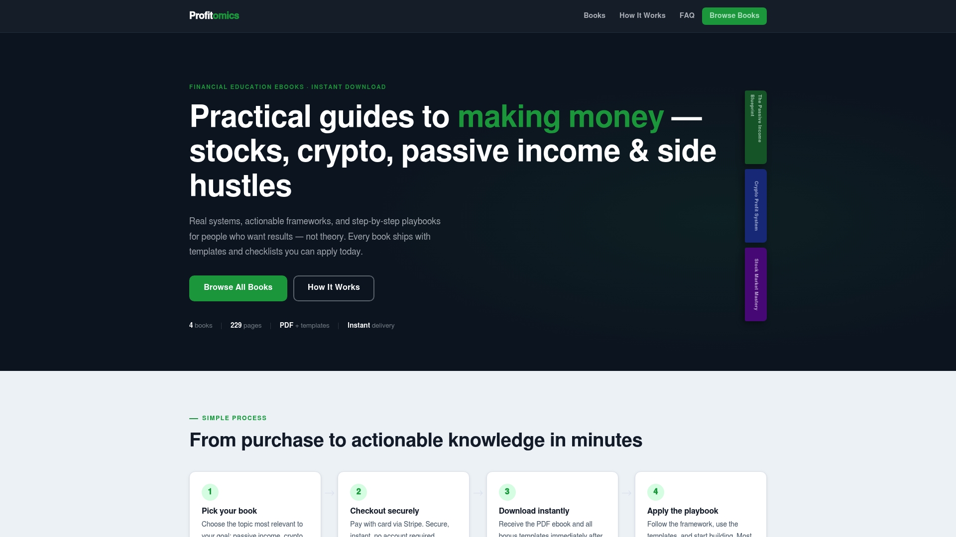
The Side Hustle to Six Figures guide, priced at $29, walks through the same kind of structured, no-fluff approach applied to building an income stream from scratch, with the templates and checklists already built instead of left for you to design. If your welcome sequence is meant to funnel new subscribers toward a paid offer of your own, whether that’s a course, a service, or a digital product, the Passive Income Blueprint, priced at $27, gives you the framework for what comes after that first email lands. Browse the full library at Profitomics and pick the guide that matches what you’re actually trying to build next.
Sources
For readers who want to verify the compliance and cadence claims in this guide, or dig deeper into the research behind them, these are the primary sources worth bookmarking.
- CAN-SPAM Act: A compliance guide for business
- Start the customer journey right with an automated welcome email series
- How Apple Mail Privacy Protection (MPP) impacts email marketing metrics
- CAN-SPAM opt-out and best practice advice
FAQ
How many emails should a welcome sequence have?
Most high-converting sequences use 3 to 7 emails spaced 1 to 3 days apart, starting with immediate delivery of whatever was promised at signup. A 3-email version covers the basics; a 5-email version gives more room to build trust before asking for a purchase.
Should I track open rate or click-through rate for welcome emails?
Prioritize click-through rate and conversion. Apple Mail Privacy Protection inflates open-rate reporting by auto-opening messages before a human ever sees them, so open rate should be treated as directional at best.
How many calls to action should one welcome email have?
Exactly one. Splitting attention across multiple CTAs consistently drags down click-through, and practitioner benchmarks flag a reply rate under 3% as a sign the copy, not the offer, needs fixing first.
Is a welcome email legally required to include an opt-out link?
Yes. Under the CAN-SPAM Act, every commercial email needs a functional opt-out mechanism that stays active for at least 30 days, with requests honored within ten business days.
Does Profitomics sell welcome email templates directly?
Profitomics sells digital guides like the Passive Income Blueprint that include ready-made templates and checklists for building income funnels, welcome sequences included, rather than a standalone email tool. Current pricing for each guide is listed on the Profitomics site.